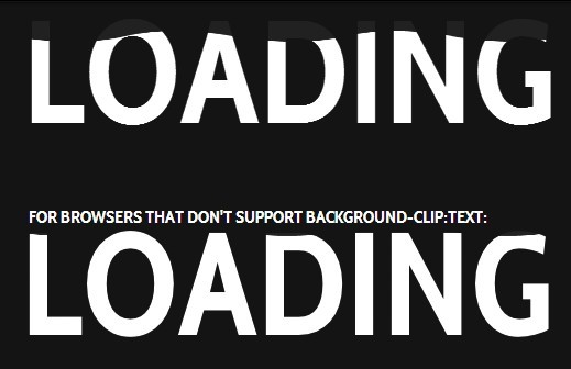
An amazing CSS3 text animation for creating text filling with water effect.
Demo
How to use it:
The Html
<link href='http://fonts.googleapis.com/css?family=Cabin+Condensed:700' rel='stylesheet' type='text/css'>
<div class="loading wave">
  Loading
</div>
<!-- For Firefox -->
<div class="loading loading-2 wave wave-2">
  <div class="ff">For browsers that don't support background-clip:text:</div>
  <div class="loading-2-text"></div>
</div>
The CSS
$background-color:#141414;
body{
 background:$background-color;
  width:100%;
  height:100%;
}
.loading{
   text-transform:uppercase;
   font-family: 'Cabin Condensed', sans-serif;
  font-weight:bold;
  font-size:100pt;
  text-align:center;
  height:120px;
  line-height:110px;
  vertical-align:bottom;
  position:absolute;
  left:0;
  right:0;
  top:100px;
  bottom:0;
  display:block;
}
.loading-2{
  top:300px;
  width:473px;
  height:97px;
  font-size:0;
  background:rgba(255,255,255,0.06);
  margin:0 auto;
}
.ff{
  position:absolute;
  font-size:12pt;
  top:-20px;
  color:white;
  line-height:12pt;
}
.loading-2-text{
  background-image:url('https://i.imgur.com/cZc1otp.png');
  width:473px;
  height:97px;
  display:inline-block;
}
@keyframes wave-animation{
  0%{background-position:0 bottom};
  100%{background-position:200px bottom};
}
@keyframes loading-animation{
  0%{background-size:200px 0px};
  100%{background-size:200px 200px};
}
.wave{
   background-image:url('https://i.imgur.com/uFpLbYt.png');
  @include background-clip(text);
  color:rgba(0,0,0,0);
text-shadow:0px 0px rgba(255,255,255,0.06);
  animation:wave-animation 1s infinite linear, loading-animation 10s infinite linear alternate;
  background-size:200px 100px;
  background-repeat:repeat-x;
  opacity:1;
}
.wave-2{
  @include background-clip(initial);
  display:inline-block;
}


